Add visualizations
Visualizations
You can add visualizations of the data participants will be donating. This is a fun experience for the participants, and it gives the participants greater understanding of the data they are about to donate, thus making their decision to donate more informed.
Below you can find some examples:
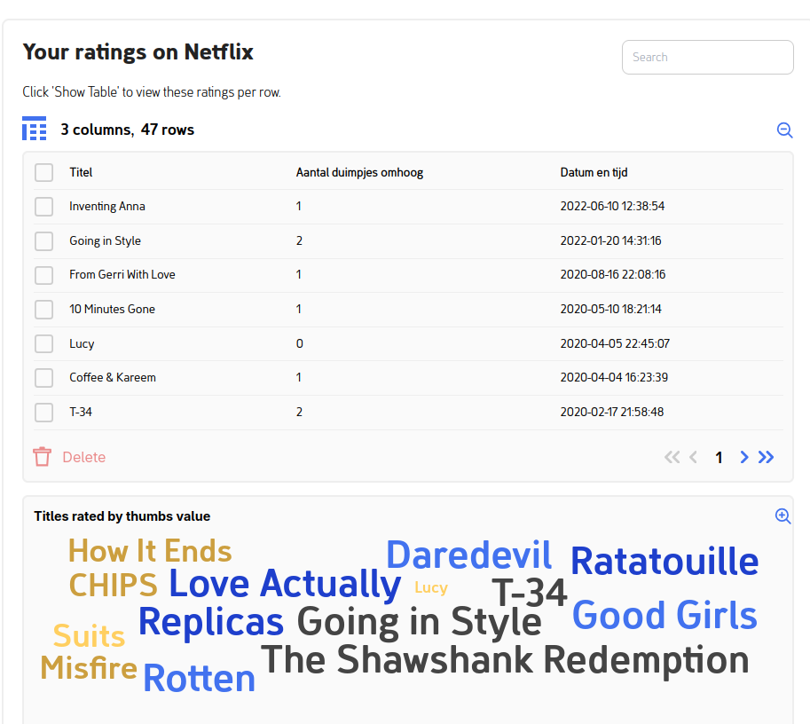
Wordcloud
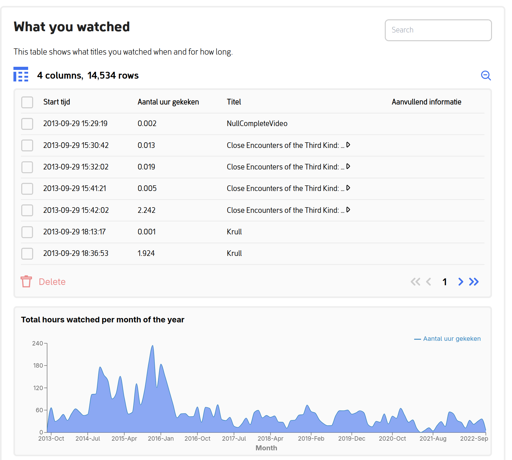
Area Graph
Add your own visualizations
Want to add your own visualizations?!
Please look at the documentation page on how to present data in visualizations to participants (in addition to tables).