Going further

The ready-made scripts cover the basics, but you can do quite a bit more once you’ve got the foundation in place. The features below give you ways to make a study richer, more interactive, or more transparent for participants.
Visualizations
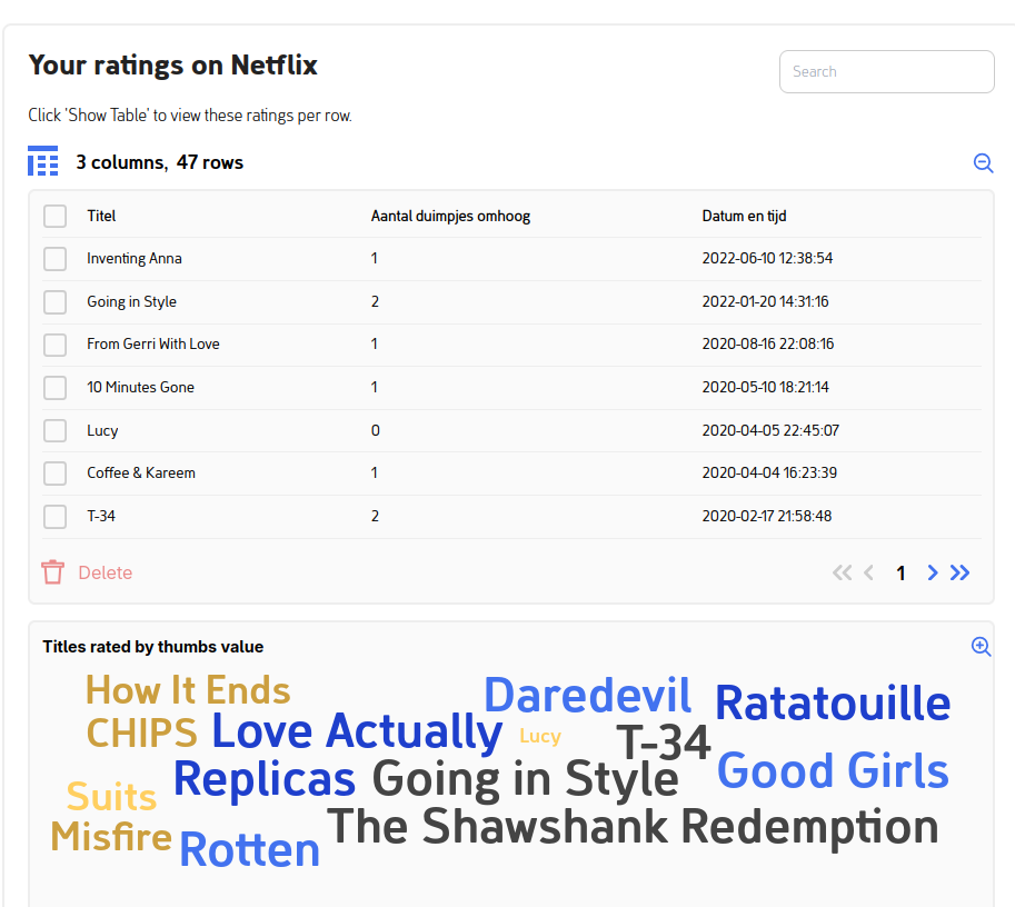
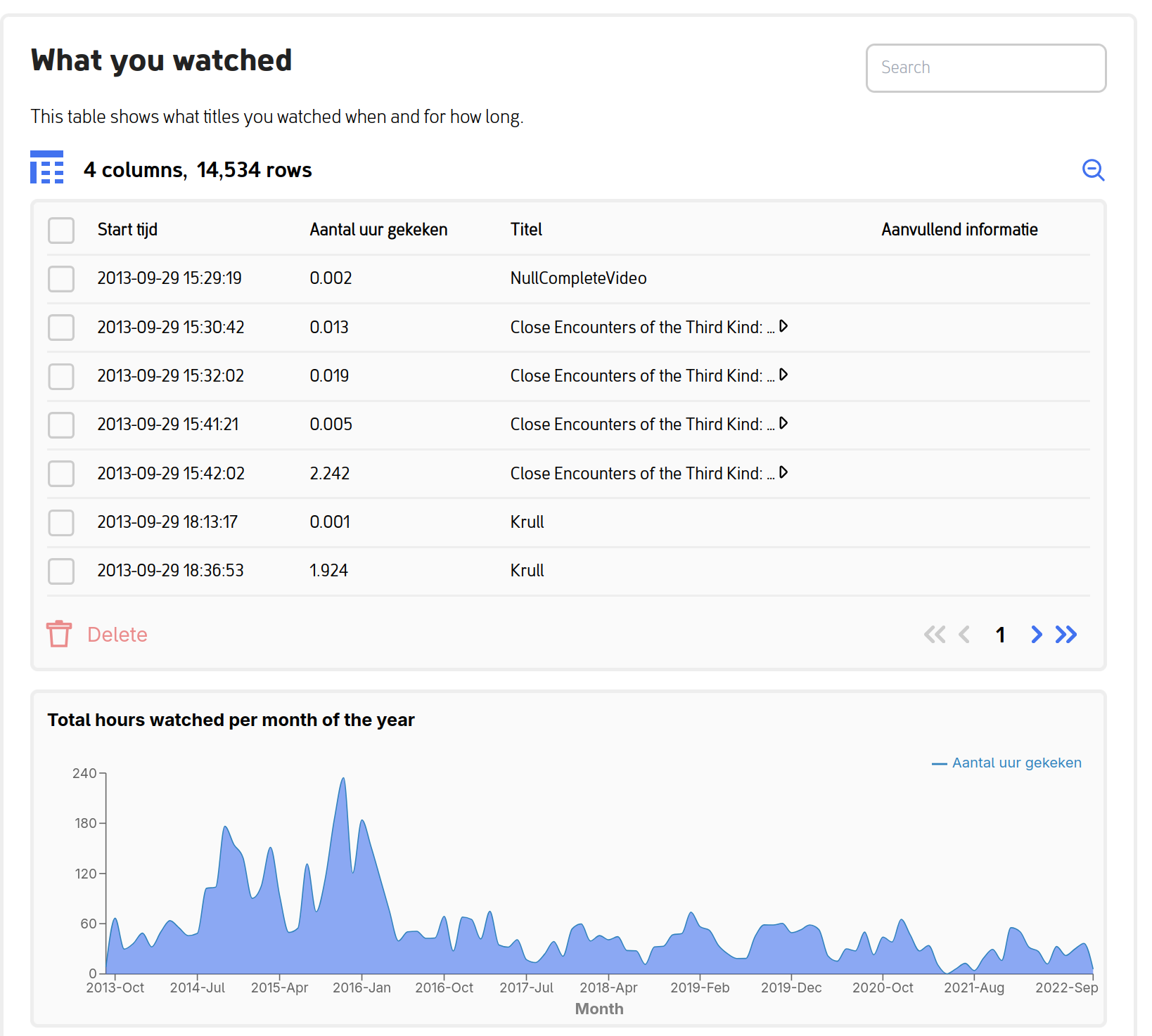
Show participants what they’re about to share. Word clouds of their most-played titles, area graphs of their viewing volume over time, timelines of their messaging activity. Visuals turn an abstract spreadsheet into something a participant can actually recognize as theirs.
Visualizations make the donation experience more engaging and the consent decision more informed. Participants who can see their data feel more in control of what they’re sharing, which is often reflected in higher completion rates and richer qualitative feedback.
Two examples from a Netflix donation flow:
Interactive features
Questionnaires that respond to donated data. Ask participants questions tied directly to the data they’re about to share. For example, you can show them their most-watched Netflix shows and ask why they enjoy them, or surface specific Facebook groups and ask how they joined. This produces qualitative context that’s hard to get any other way.
Multiple file uploads. Some studies need more than one file from a participant: different time periods, multiple group chats, related platforms. The interface walks them through it without confusion.
Custom development
If the ready-made scripts and built-in features don’t cover what you need, you can build your own data donation task from scratch. This requires some Python and a willingness to read documentation, but the platform is designed to be extended.
The full developer documentation lives on the project’s documentation site:
Data donation task documentation →
It covers setting up a development environment, writing extraction scripts, adding custom visualizations, testing, and deployment. The source code is on GitHub if you want to dig into the internals or contribute back.
Have a question or want to discuss your study?
We can answer your questions about:
- Adding visualizations to engage participants
- Building custom interactive features
- Creating a Data Donation Task from scratch